SeaGL Style Guide
The goal of this guide is to group the common effort on the creation of design materials for the Seattle GNU/Linux Conference. It describes best practices for creating new materials and applying the visual identity of the event.
Design
This section contains information about the visual elements of the conference, how to use them and best practices. All design assets are licensed under CC BY-SA, unless otherwise specified.
The Logo
Our logo is the most recognizable SeaGL symbol. Is composed of two elements: The low-poly seagull illustration with a circular two blue tone background and a gray ribbon underneath with the conference name.
As the logo is multicolored, we have limited background color options. White and the blue variations described on the color palette are the options for multiple context usage. Also, a special blue-white background with gold separation on the ribbon is used.
A minimum clear space around the logo is required, about 50% of the diameter on each side. Using with small size are not recommended, due to the logo complexity.
For the online events, there is a special version where the seagull is with a microphone. It follows the same restrictions as the classic version.
The logo images may be used without advance permission, subject to the following requirements:
- The use is only in connection with promoting the SeaGL conference.
- The use does not imply sponsorship or endorsement by the SeaGL conference.
- Where possible, the logo hyperlinks to https://seagl.org or an appropriate page on that site.
- The logo images are not altered, except to proportionally resize.
Usage examples
-
Blue Backgrounds
-
Special “badge” background and other formats, with spacing
-
White and White 2 backgrounds
Font Styles
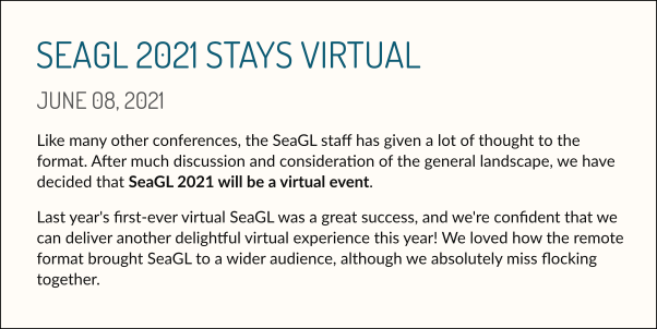
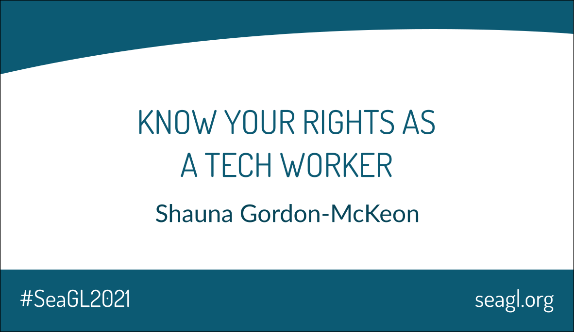
The SeaGL typography is one of the core elements that defines the conference design style. We use two fonts, Dosis and Lato, according to the following:
- Dosis (Regular): Applied on headers / titles; capitals only.
- Lato: Other text elements, like text body.
Text alignment can vary by application, the important thing is to stay good in context.
Usage Examples
-
Blog post
-
Social Media conference call:
-
Print handbill:

Color Palette
Any used colors should be taken either directly from the palette or be derived from the palette:
| Color | HEX | RGB | CMYK |
|---|---|---|---|
| Tidal Blue | #1D7193 |
RGB 29 113 147 |
CMYK 82 40 25 14 |
| Puget Sound | #0C5A73 |
RGB 12 90 115 |
CMYK 87 46 34 25 |
| Deep Ocean | #074558 |
RGB 7 69 88 |
CMYK 89 47 40 47 |
| French Fry Gold | #FCB320 |
RGB 252 179 32 |
CMYK 2 34 89 0 |
| Wet Sand | #B1742A |
RGB 177 116 42 |
CMYK 24 53 88 17 |
| Bread For Screaming At | #FFFCF7 |
RGB 255 252 247 |
digital only |
| Feather White | #FFFFFF |
RGB 255 255 255 |
CMYK 0 0 0 0 |
| Brave Gull | #E0E0E0 |
RGB 224 224 224 |
CMYK 0 0 0 16 |
| Gloomy Sky | #CCCCCC |
RGB 204 204 204 |
CMYK 0 0 0 23 |
| Stormy Sky | #B3B3B3 |
RGB 179 179 179 |
CMYK 0 0 0 39 |
| Storm Cloud | #565656 |
RGB 86 86 86 |
CMYK 0 0 0 80 |
| Penguin Black | #0D0D0D |
RGB 13 13 13 |
CMYK 0 0 0 100 |
Color palette overview
#1D7193
RGB 29 113 147
#0C5A73
RGB 12 90 115
#074558
RGB 7 69 88
#FCB320
RGB 252 179 32
#B1742A
RGB 177 116 42
#FFFCF7
RGB 255 252 247
#FFFFFF
RGB 255 255 255
#E0E0E0
RGB 224 224 224
#CCCCCC
RGB 204 204 204
#B3B3B3
RGB 179 179 179
#565656
RGB 86 86 86
#0D0D0D
RGB 13 13 13
Color Usage
The color usage must respect others elements’ rules, like the logo. Mainly, the blue and white variations are used for backgrounds.
The White 2 color is used in digital material with focus on text, such as the website, for better reading.
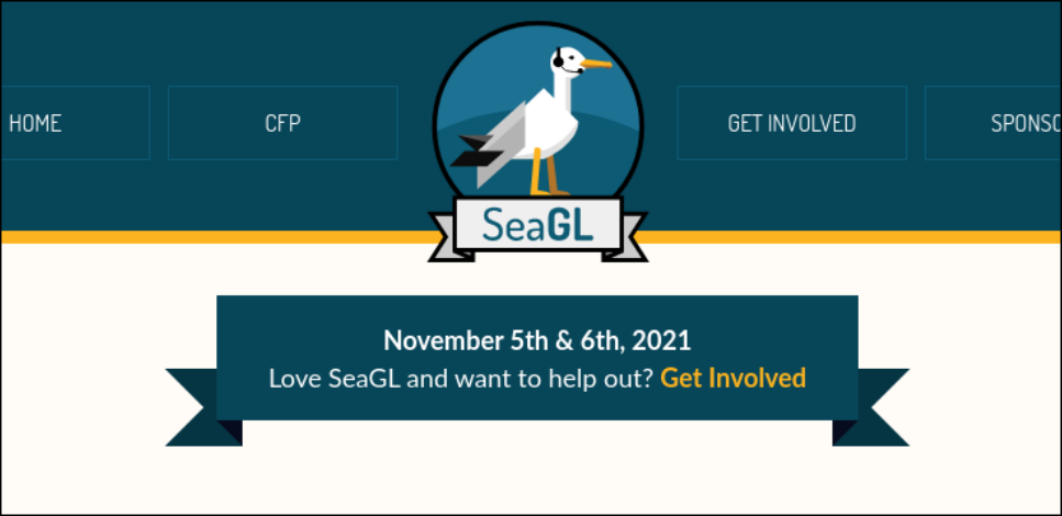
Gold is applied to action links and to contrast with the blue / background, depending on the situation.
Usage examples
-
Website Ribbon
-
Profile Banner

Design Assets
All design materials are available in the design folder inside the SeaGL outreach repository.
Specific materials and other quick reference files:
This repository also contains Patch stickers, branded QR codes, and lots of year-specific assets (e.g., maps, flyers, the program booklet, etc.).